What Makes a Home Look Cheap? Common Design Mistakes and Affordable Fixes
What makes a home look cheap is usually not its price. A home can feel inexpensive when it looks cluttered, mismatched, poorly scaled, outdated, or mass-produced, especially when lighting, furniture placement, and finishes compete instead of working together.
The fastest improvements usually come from editing what is already there: remove visual clutter, use rugs and curtains at a convincing scale, soften harsh lighting, repair neglected details, and create a more coherent color story. These changes often cost less than replacing an entire room.
Why some homes look less expensive than they are
A polished room feels deliberate. It has enough empty space to let important pieces stand out, furniture that fits the room, and finishes that repeat in a controlled way; when those relationships break down, even good-quality items can appear ordinary.
Price is only one signal.
Perceived quality comes from proportion, maintenance, light, texture, and visual consistency. A secondhand wooden table can look more considered than a costly matching set when the table has the right scale, a useful position, and enough contrast around it. The same principle applies to bold colors, vintage furniture, rattan, synthetic materials, and do-it-yourself pieces: context determines whether they look intentional.
A common belief says, “A neutral room automatically looks expensive.” That idea is incomplete. Neutral colors can still look flat when the room has poor lighting, tiny artwork, damaged finishes, or furniture that is too small; a colorful room can feel refined when its palette is controlled and repeated with purpose.
1. Clutter and excess furniture make a room feel unfinished
Too many objects compete for attention, so the eye struggles to identify a focal point and the room begins to resemble storage rather than a composed living space. Crowded shelves, overloaded mantels, visible cables, shoes in the entryway, and furniture blocking circulation all contribute to that impression.
Start with the surfaces you see first.
Remove everyday items from open surfaces before buying storage. Keep the pieces that serve a purpose or have genuine meaning, then group smaller objects instead of spreading them across every shelf. A clear entryway also changes the first impression: shoes belong in a contained rack or cabinet, while coats should have a defined place.
Use circulation as a practical test.
- Can you walk through the room without turning sideways?
- Does each seat have a usable surface nearby?
- Can you see a clear focal point from the doorway?
- Are decorative items hiding useful architectural features?
Do not fill an empty corner simply because it exists. Empty space gives the furniture that remains more visual weight.
2. Poor scale and proportion create the cheap-looking living room
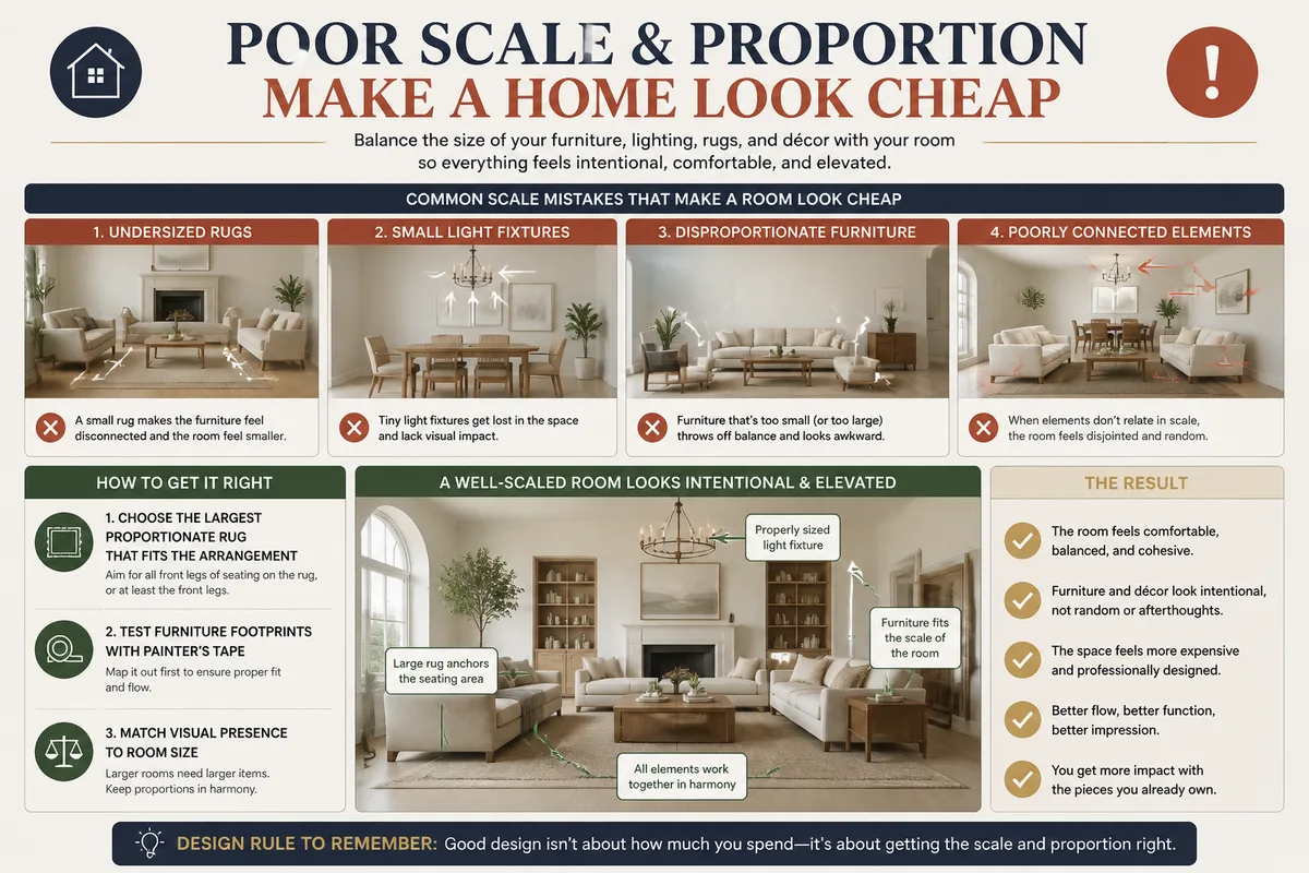
Small rugs, tiny light fixtures, undersized artwork, and furniture that overwhelms the room are among the clearest proportion problems because they make otherwise attractive pieces appear disconnected from their surroundings.
Scale matters more than labels.
Choose the largest rug that fits the seating or dining arrangement without blocking doors, vents, or necessary pathways. In a living room, a rug that barely touches the coffee table can look isolated; extending it beneath at least part of the seating group usually creates a stronger connection, provided the room allows it.
Measure before shopping.
Mark the proposed rug or furniture footprint on the floor with painter’s tape, then live with the outline for a day. This simple check reveals whether a sofa leaves enough walking space, whether a cabinet makes the room feel crowded, and whether a pendant will dominate the visual field.
A tiny ceiling fixture rarely balances a large room.
When funds are limited, fix the largest proportion problem first. A correctly sized rug or substantial secondhand lamp can have more visual impact than several small accessories scattered around the room.
3. Harsh or outdated lighting makes finishes look cheaper
Lighting changes how paint, flooring, fabric, metal, and wood appear, which means an attractive room can feel flat or poorly finished under a single harsh ceiling fixture. Mismatched bulbs and exposed cool light often make the atmosphere feel accidental.
One ceiling light is rarely enough.
Build three useful layers where the room allows it: general light for movement, task light for reading or preparation, and accent light for artwork or architectural details. You do not need expensive fixtures; a well-placed floor lamp, a shaded table lamp, or a plug-in wall light can solve a dark corner without rewiring.
Replace bulbs as a group within the same visual zone.
Color temperature is a context choice rather than a universal rule. A kitchen work surface may need clearer light, while a bedroom or living room often feels more comfortable with a softer tone; always follow the fixture’s compatibility and the bulb manufacturer’s instructions.
Never improvise electrical connections.
Switching a compatible bulb is a basic maintenance task, while new wiring, ceiling alterations, or uncertain fixtures should be handled by a qualified electrician, particularly in older homes where existing circuits may require inspection.
4. Matching furniture sets and generic finishes remove character
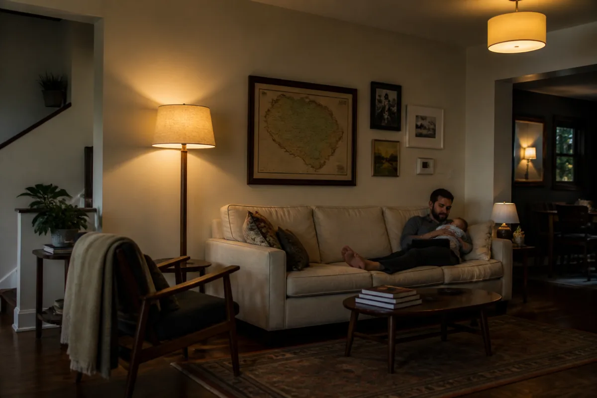
A complete furniture set in one finish can make a room feel flat because every piece has the same visual weight, color, and silhouette. The issue is uniformity, not affordability: budget furniture can look intentional when it is mixed with different textures, shapes, and one or two distinctive pieces.
Break the showroom effect.
Keep a coordinated foundation, then introduce variation through a wood tone, woven texture, aged metal, painted surface, or upholstered piece. Replacing standard handles on a dresser or cabinet can sharpen its appearance, provided the new hardware fits the existing holes and does not damage a rental or fragile material.
One contrasting piece is enough to start.
Choose a chair, mirror, side table, or vintage object with a different shape rather than buying another item from the same collection. A secondhand piece can work well after cleaning, tightening, and repairing it; visible damage should be addressed before styling.
Do not buy a full matching set.
If you already own one, separate the pieces between rooms where practical, vary the textiles, and remove duplicate tables or accessories. This creates breathing space without forcing you to replace serviceable furniture.
5. Unclear colors, patterns, and finishes create visual noise
A room can contain strong colors and still feel polished, while a room filled with pale tones can feel disorganized if every surface introduces a different undertone, pattern, or finish. The useful goal is a recognizable color relationship rather than a compulsory neutral palette.
Choose a simple color story.
Use one dominant color family, one supporting color, and a small number of accents that appear more than once. Test paint and fabric in the actual room because daylight, artificial light, flooring, and nearby surfaces change how colors read throughout the day.
Patterns need visual space.
When a patterned rug, patterned curtains, patterned cushions, and busy artwork all compete, reduce one layer before replacing everything. Keep the item with the strongest scale or personal meaning, then let surrounding surfaces become quieter.
Bold color is allowed.
Use it on a wall, chair, cabinet, or artwork with enough surrounding calm to make the choice look deliberate. Excessive chintz, highly themed decoration, or repeated novelty motifs become tiring when every item announces the same style at once.
6. Flooring, curtains, ceilings, and hardware reveal neglected details
Large surfaces establish continuity across a home, so abrupt flooring transitions, thin unlined curtains, damaged windows, peeling paint, and standard hardware can draw attention away from the room’s stronger features even when the main furniture is attractive.
Repair before decorating.
- Secure loose handles and tighten visible fittings.
- Steam or press curtains so they hang cleanly.
- Touch up scuffed trim where the existing paint is compatible.
- Clean window glass, frames, switches, and skirting boards.
- Remove duplicate mats and temporary-looking coverings.
Hang curtains high enough to create a longer visual line, while keeping the rod and fabric practical for the window, radiator, and rental agreement. Curtains that stop awkwardly above the floor or cover only part of the window can make the wall feel shorter and less finished.
Popcorn ceilings and dated finishes require caution.
Before disturbing textured ceilings, old paint, flooring, insulation, or wall coverings, identify the material and check local requirements; suspected asbestos or an uncertain construction layer calls for professional assessment rather than scraping it as a weekend project.
Use one flooring material across connected areas when replacement is already planned and technically suitable. Do not replace sound flooring solely to chase a trend.
7. Generic artwork and decorative clichés make rooms feel mass-produced
Mass-produced word art, slogan prints, and gallery walls assembled from identical sets can make a room feel impersonal because the decoration appears selected by template rather than connected to the people who live there.
Meaning beats quantity.
Display fewer pieces with stronger relationships to the room: a large photograph, a local print, a child’s work in a consistent frame, a textile, a found object, or a painting bought secondhand can all contribute character. The arrangement should suit the wall and furniture below it, rather than leaving tiny pieces floating in a large empty area.
Large artwork often solves a scale problem.
Use paper templates to test size and position before drilling. Keep the center of the arrangement at a comfortable viewing height, align the group with nearby furniture, and repeat one framing finish if the collection contains many different colors.
Skip decorative filler.
A bare wall can remain bare until you find something appropriate. Temporary mass-produced art is rarely a better choice than a little patience.
8. Exterior maintenance shapes the first impression
The exterior can make a well-designed interior feel neglected before a visitor reaches the front door, particularly when peeling paint, a damaged handle, dirty windows, overgrown planting, or a cluttered entrance is visible from the street.
Maintenance comes before style.
Clean the entry path, remove dead plants, organize bins where local rules permit, wash accessible windows safely, and repair obvious hardware. A front door color is a style choice; it does not automatically make a home look cheap, while flaking paint, rust, or rotten wood clearly signals deferred maintenance.
Check roof, windows, and elevated areas from a safe position.
Roof repairs, high exterior cleaning, window replacement, and structural work require suitable equipment and qualified tradespeople when access or building risk is involved. Never use a decorative makeover to hide water damage or movement in the structure.
Small gardens benefit from editing too. For compact yards and patios, these small-space garden ideas can help organize planting, seating, and circulation without filling every available surface.
How to make a home look more expensive without overspending
The best budget strategy is to correct the most visible mismatch first, then stop before the room becomes crowded with new purchases. A free edit can outperform a decorative shopping trip when clutter or poor placement is the main problem.
Start with the room people use most.
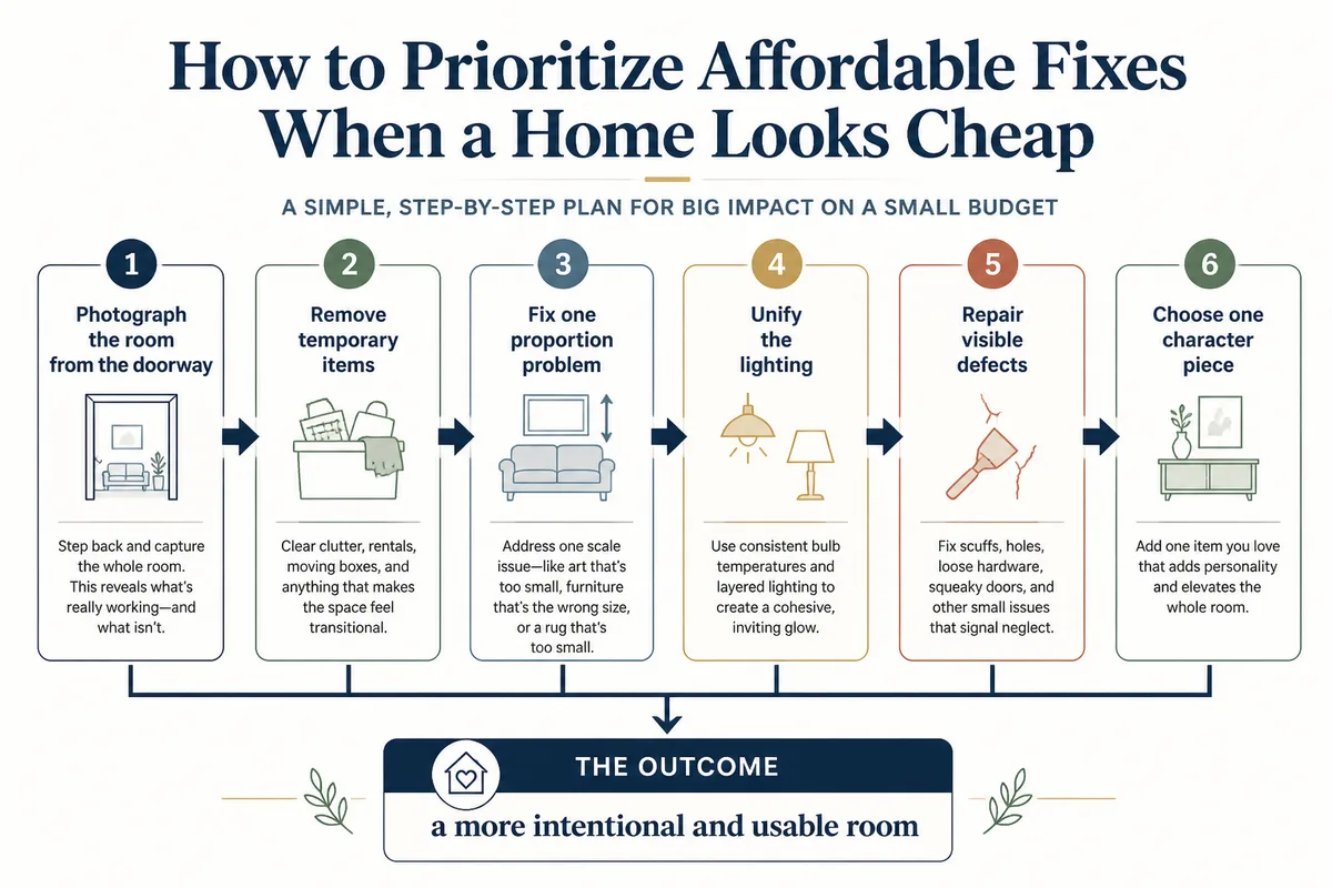
- Photograph the room from the doorway. The image exposes clutter, blocked routes, awkward scale, and competing focal points.
- Remove temporary items. Clear packaging, loose cables, excess cushions, unused furniture, and everyday objects from open surfaces.
- Fix one proportion problem. Test the rug, sofa, artwork, or light fixture footprint before buying or moving anything.
- Unify the lighting. Group compatible bulbs by zone and add one portable lamp where the room has a dark or harsh area.
- Repair visible defects. Tighten hardware, clean surfaces, press curtains, and deal with scuffs before adding decoration.
- Choose one character piece. Add a distinctive chair, artwork, mirror, textile, or secondhand object instead of several small fillers.
Follow that order.
Free changes include editing surfaces, rearranging furniture, removing duplicate decor, cleaning windows, and changing artwork positions. Low-cost improvements include compatible bulbs, curtain steaming, replacement handles, paint touch-ups, secondhand lamps, and properly sized textiles; larger projects include flooring, cabinetry, windows, ceilings, and electrical work, which deserve measurement, planning, and professional input where safety is involved.
Common decorating mistakes to avoid
Most disappointing makeovers fail because they add objects before diagnosing the room, follow a rigid rule without checking the space, or spend money on visible style while ignoring maintenance and proportion.
These mistakes are easy to prevent.
- Buying a tiny rug because it costs less: the seating arrangement then looks disconnected; measure the usable zone first.
- Using one harsh ceiling bulb: finishes lose depth; add portable task or accent lighting before replacing fixtures.
- Matching every finish: the room feels generic; keep a coherent base and vary one or two materials.
- Filling every shelf and corner: focal points disappear; remove items until circulation and sightlines improve.
- Covering damage with decoration: underlying moisture, unsafe wiring, or structural movement remains; investigate the defect before styling.
Do not chase a universal luxury formula.
A polished home can contain color, inexpensive furniture, vintage objects, synthetic materials, or do-it-yourself improvements when those choices are maintained, correctly scaled, and connected to the rest of the room. The strongest affordable home decor fixes make the space feel intentional, comfortable, and usable—not artificially expensive.
When a home feels cheap, improve the relationships between its elements first: less visual noise, stronger scale, softer and better-distributed light, maintained surfaces, and decoration with a reason to be there. Those choices make a home look considered without requiring a designer budget.